![]()
Petrus
Crafting Intuitive Dashboards for Data-Heavy Industrial Systems
UX Research • Industrial UX Design • Dashboard Design • Information Architecture • Data Visualization
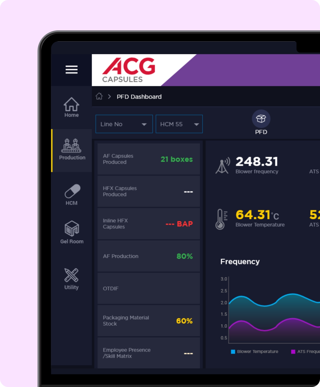
Petrus is a CNC machine production unit operating in a highly data-intensive industrial environment.
Operators and supervisors rely on real-time machine data to monitor performance, diagnose issues, and maintain production efficiency.
Orangy Design partnered with Petrus to design an intuitive, operator-friendly dashboard that transforms complex industrial data into clear, actionable insights.
The Challenge
Industrial dashboards often prioritise data availability over usability. For Petrus, this resulted in:
- Overloaded screens with dense machine metrics
- Critical insights buried under raw data
- High cognitive load for operators working in time-sensitive conditions
The challenge was to design a dashboard that could support fast decisions on the shop floor, without requiring users to interpret complex data structures.
Our Solution
We approached the dashboard from a human-centred, workflow-first perspective, designing around how operators actually monitor and respond to machines.
- Data was structured to surface what matters most, first
- Visual hierarchy guided attention to exceptions and anomalies
- Interactions were simplified to reduce effort in high-pressure moments
The result was a dashboard experience that feels calm, clear, and dependable, even in data-heavy environments.
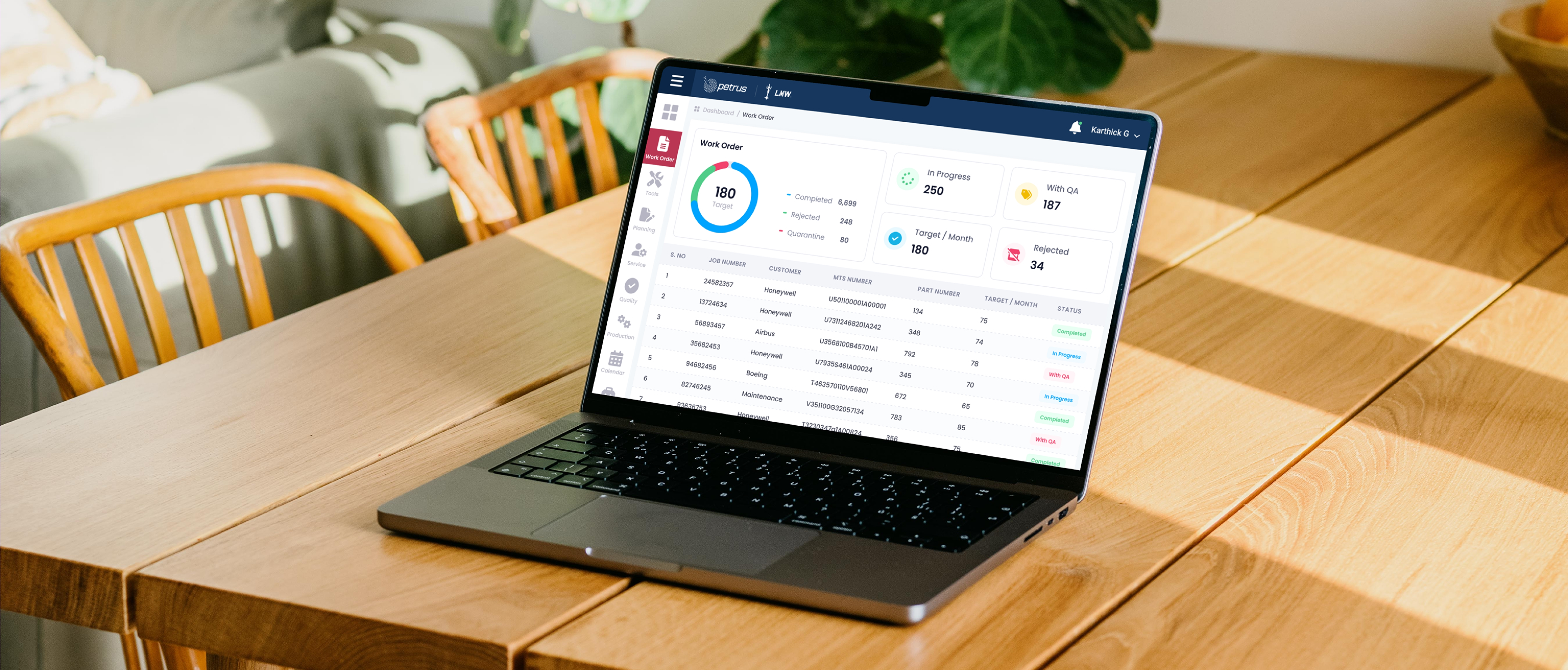
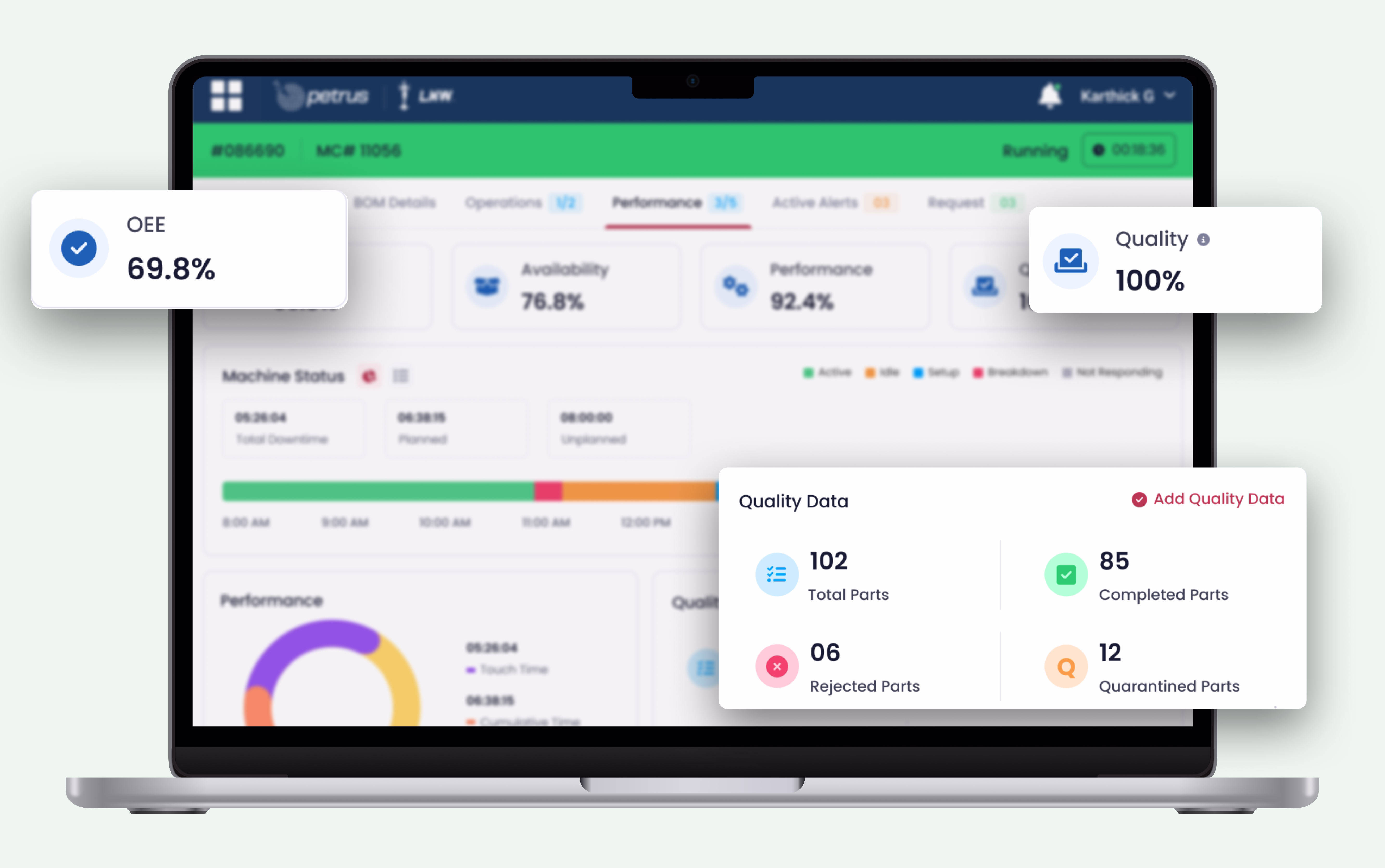
Key Features
The dashboard was designed with a focused set of features that balance industrial complexity with everyday usability:
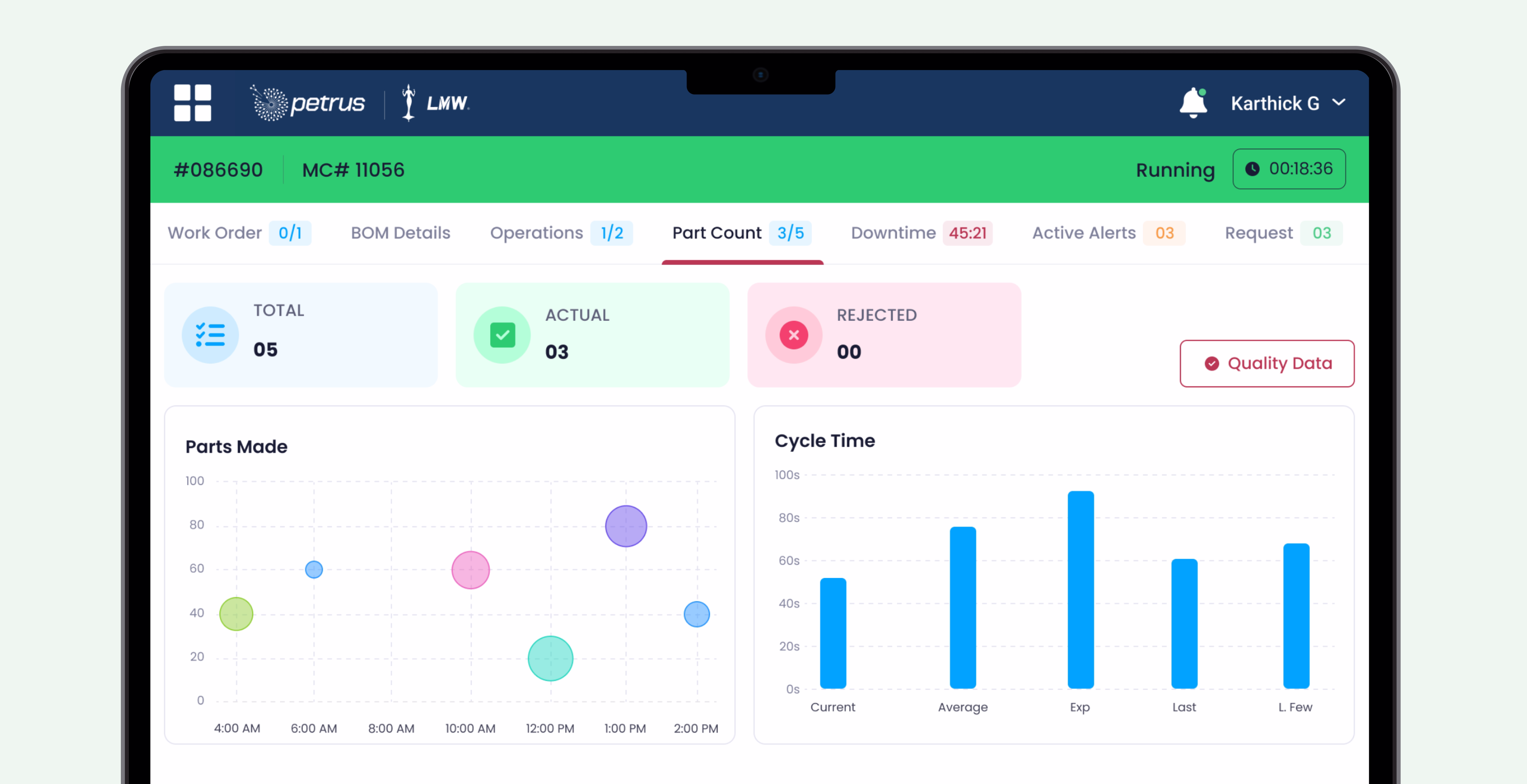
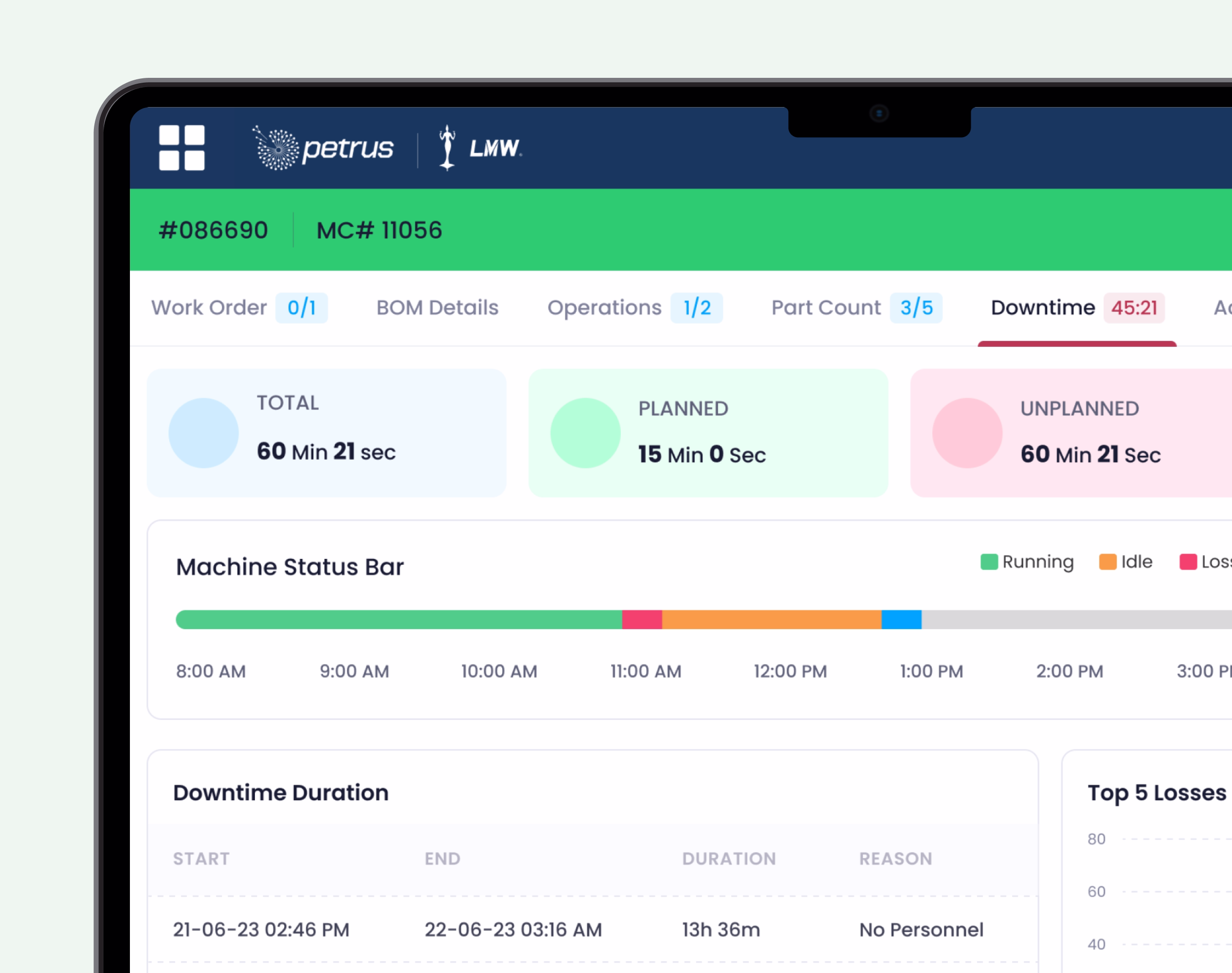
Real-Time Machine Monitoring
Live visibility into machine status, performance, and downtime.
Exception-Focused Insights
Clear visual cues highlighting anomalies, thresholds, and alerts.
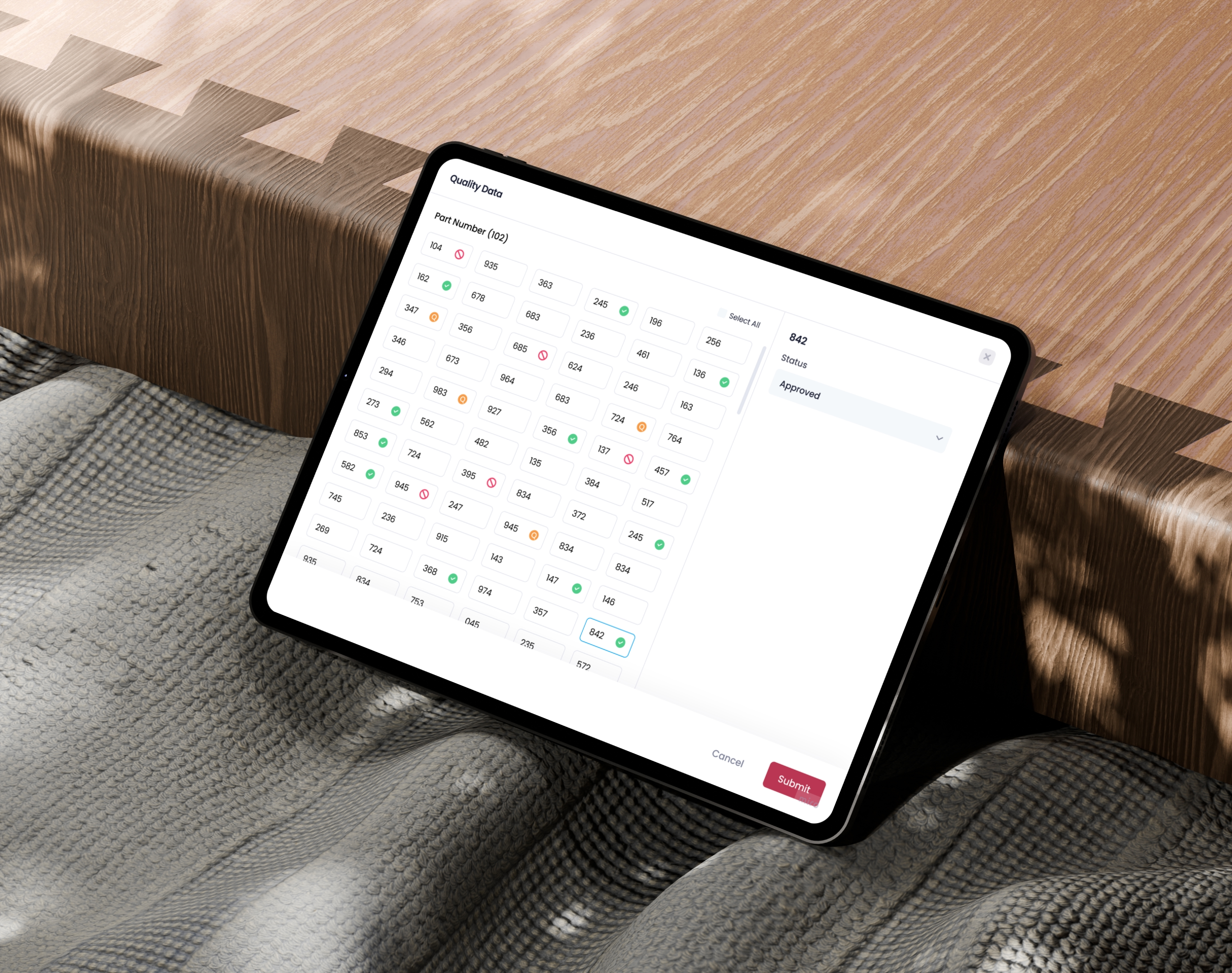
Role-Aware Views
Simplified dashboards tailored for operators and supervisors.
Clear Data Visualization
Charts and indicators designed for quick comprehension, not analysis overload.
The Outcome
The redesigned dashboard delivered measurable improvements on the shop floor:
- 35% faster issue identification, enabling quicker response to machine anomalies
- 25% reduction in operator cognitive load, based on usability testing feedback
- 30% improvement in decision-making speed for supervisors
Final Thoughts
Industrial systems don’t need more data—they need better experiences. By humanising complex machine information, we helped Petrus move from data overload to decision clarity.
Outcome: A dashboard that supports people first, while still meeting the demands of modern industrial operations.
Works